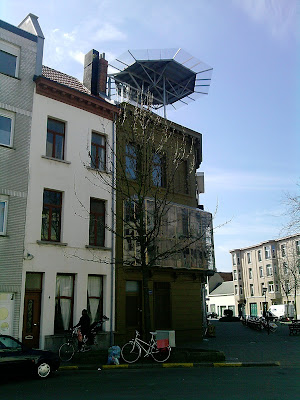
In both rich and dull streets, the narrow plots and buildings adds delight to the street elevation in a way that broad modern buildings with vertical and horizontal repetitive facade elements cannot match, and where maybe only the first floor facade will differ a little from the upper floors.
The failure of post-war architecture is particularly evident in Antwerp where post-war building heights have been increased around parks and along (traditionally) wide streets. Here the heights of the new buildings are almost ten floors, with repetitive horizontally orientated facades with few variations and few details. Whether one sees the buildings from close up or at a distance, they give nothing back to the public realm of the street.
 |
| A delightful roof light on a small corner building at Mechelseplein in the southern half of the city center. |
Facades elements should differ on lower, middle and upper floors
However, Antwerp should learn from the past, and require new buildings to vary the facade elements on the various floors of a building. A rule of thumb would be to require the design of the two bottom and the two top floors of the facade to vary from the design of the middle floors. In addition the bottom and the top floors should be more richly detailed, to add joy and surprise to the street scene. Either as people hurry by on a daily basis or when they have more time and stop and study the building in more detail, discovering the richer details towards the top of the building as as one approached closer to the building. This latter principle is applied to great effect on many modern early twentieth century buildings and adds joy and surprise to the public realm of the city. Any variations to set back roof floors come in addition to the principle of adding details to the top floors of the facade of a building.
 |
| A delightful something on top of a three storey house in the far north of the inner city. |
Facades with depth and strong vertically elements should be encouraged
Antwerp should also learn from the past in requiring most buildings to have tall and narrow windows. Some early twentieth century buildings have very horizontally orientated facades, with long strips of windows with great success. But this principle has to a great extent been misused in a majority of post-war buildings, just adding dreariness to the public realm of the street. Buildings with windows along more than two thirds of the length of the facade in total should also in most cases be avoided. Similarly, most facades should normally have strong vertically orientated elements. And facades with little or no depth should in most cases be avoided, as the depth creates little shadows that will vary throughout the day. In a similar way trees add shadow that moves and changes with the moving sun.
And the above principles apply equally to Antwerp as to other towns and cities throughout the world.