What good is the warmth of summer, without the cold of winter to give it sweetness. JS

Sunday, 1 December 2013

Planning for affluence and abundant wealth. Or not?

My latest engagement in London has brought me from Hammersmith in West London in spring to Victoria in the heart of Central London this autumn, both very affluent areas, the former more residential than the latter. Working on spatial planning in Inner London very much reflects the economic prosperity of southern  England, where private affluence and wealth is abundant.

During the summer I passed through a majority of the towns and cities along the south coast by bike during three weekends, from Margate in Kent to Penzance in Cornwall, with Sidwell Street in Exeter an unexpected surprise. 

Plan for the future, not the present 
Having been through more than half the streets of Central London (zone 1: 50 km2) and most towns along the south coast, this gave me a new perspective on spatial planning, urban design, public realm, transport and urban policy. With vast amount of private and public money invested in towns and cities, too much is maybe going to waste. Either because the short term solution is not a long term answer. Or because planners and decision makers fail to recognise that past problems and future challenges are not equal. Or that they fail to plan for an economy that fluctuates in cycles, with prosperity followed by austerity and vice versa. Planning for a stable economy too often misses opportunities, either because prosperity is returning or prosperity is veining, but plans are reactive rather than proactive.

Give distinct identity to a place 
What makes Exeter's Sidwell Street such a delight is partly its built heritage, with many quality buildings in a wide variety of styles, from different periods and different decades of the 20th century. In other words, neither uniform, stunning or dreary, 18th, 19th or 20th century architecture. But the public realm of the street has received a stunning contemporary makeover, bringing together the various styles and materials of the buildings. I saw it at night, after light rain, when large numbers of first year students where going from venue to venue during first week of term. There were also buses going in either directions on a rather narrow carriageway, with the pavements on either sides being wider and having low curbs. 

Some problems are better left unresolved 
Certain challenges and issues are sometimes better left unresolved as they may go away in time. One is cars, congestion and car parking, an obsession of post-WWII planning. Another is demolishing or merging small dwellings to cater for larger inner city households. But people are able to adapt to their physical surroundings or move elsewhere. And maybe this is what spatial planning should allow for more frequently, rather than incite very expensive physical remodelling of cities to cater for challenges and issues that may pass a generation into the future. That leaves the problem of knowing what issues to deal with and what challenges to leave unresolved. But only a higher power knows the answer to that. 

People move on, and urban life too 
Observing city life in London, one is struck by the share complexity of how separate communities go about their daily life, but not necessarily ever being in contact with one another. The communities can be either social, ethnic, cultural, demographic, economic, age etc or a multitude of some of these, and sometimes live entirely parallel lives from cradle to grave, within the same or adjacent areas. 

Similarly, planning for urban life has never been easy, as a lot of post-war planning has proved. People change, circumstances change and society change. Not least is that very evident in London and along the south coast, where former lively communities have vanished, or new communities have established. Not least new ethnic communities have sprung up, challenging the established order. But this multitude of communities is maybe less evident in the physical fabric of most of London and along most of the south coast. 

Mini-Manhattans need to be the centre of things
Croydon, the regional centre of South East London has been a disaster in making for over half a century and it is hard to see how current and future plans can ever deliver the necessary change. Planning and delivering a high rise town centre is maybe as difficult as planning and delivering a multi-level town centre. And high rise living is maybe more appropriate in the centre of a very large and very accessible area, not in the outer suburbs of large cities. Similarly, high rise living and high rise offices may only work with extreme quality in the public realm. But that is only possible where finance is abundant. And in London there are maybe too many competing town centres for that to ever happen in Croydon. Maybe it would have been better for Croydon to plan a four to eight storey town centre, with normal streets, pavements and curb side parking, challenging enough in the outer suburbs of London.


My house in South London, halfway between Brixton, Peckham, Dulwich and Camberwell, on a small hill with views northwards of London from Richmond in the west to Canary Wharf in the east, during a (past) winter day. 


Public Realm Strategy for Victoria
The subject of my engagement at Westminster was preparing a public realm strategy for Victoria Opportunity Area, an area stretching from Parliament Square to Victoria Coach Station, including Victoria Street and Victoria Station. It included 3D illustrations of streets, parks, squares, trees and buildings, half a dozen thematic concept diagrams, a dozen diagrams of existing situation and detailed policies and analysis for nine prioritised areas.


The Victoria area is primarily the area on either side of Victoria Street, a rather narrow street with tall post-war buildings, some of them already replaced once since the WWII. Victoria Street runs a kilometre from Parliament Square in the north east to Victoria Station in the south west. The area is bound by Buckingham Palace and St James Park to the north, Millbank to the east and Pimlico to the south, both bordering the Thames, and Belgravia, Sloane Square and Kings Road to the West. The area consists mostly of private and government offices, bordering mostly private residential areas to the south and west.

Friday, 1 November 2013

Learning from London's rich built heritage


A seven storey office building next to a three storey church with a 41 storey office tower behind. Is seven storeys too tall adjacent to otherwise smaller listed buildings in London in 2013?

A ninety years old, nine storey residential building opposite one of London's busiest main line stations. Is nine storeys too tall adjacent to tube stations in London in 2013?

A eighty years old, seven storey office building with strong vertical elements. Can 21st century facades have strong vertical elements, without copying the past?   

Strong colours on an otherwise ordinary mix-used brick building in central London. Can strong colours add interest to modern glass, brick, stone, steel and concrete buildings? 

A eighty years old, ten storey residential building along a high street in suburban west London. Is ten storeys too tall in suburban London in 2013?  

A seventy years old, thirteen storey office building in west London. Is thirteen storeys too tall for 21st century London?
A nine storey corner office building in central London. Is three additional storeys on selected corner buildings too tall for inner London? 

Four storey residential buildings, with double mansard roofs in west London. Can retrofitting double mansard roofs on commercial and residential buildings add to the housing supply of 21st century London? 

Some glazed-in balconies on the upper floors of a new eight storey residential building. Can retrofitting glazed-in balconies add floor space and increase the sustainability of public and private post-war housing in London?

An unsymmetrical facade element in an already richly detailed facade. Can small facade variations add to the richness of 21st century buildings in London?

A rather terrifying 1970s Whitehall office building with maybe some interesting (if somewhat difficult to notice) facade qualities. However, just repeating the same facade element over and over again and the lack of trees along the pavement adds little to the public realm of the area.    
Large four storet houses along the Thames in west London. Is four storey residential buildings too tall for 21st century suburban London?

A seventy years old, seven storey residential building on top of a tube station in west London. How a horizontally orientated facade can work, if vertically elements are also strongly present. 

A four storey commercial building in a 2-3 storey residential street in south London. Is such a deviation of building heights unthinkable in 21st century suburban London? 

A rather simple but stunning station entrance, where curves, light and height is used to great effect in west London, without (necessarily) increasing the footprint of the building.
.
Who forgot to order more of these benches? The present contemporary wooden benches are nice, but hey, hardly memorable.

Who replaced this stunning blue and red arrow with the present very dull black and yellow 'Way out' sign?

Or this blue sign with white capital letters and white arrow?

Or as it could be with white arrow pointing left, right, up or down?

Waiting for the train home in the evening in mid July at platform 1 at the new Blackfriars Thameslink station, looking east towards Tate Modern, the Shard, Tower Brige and the Cheesegrater, the newest awkward looking office tower in the City, only a 10 mins train journey southwards to Denmark Hill station (past Elephant & Castle and close to Camberwell, Peckham, Brixton and Dulwich).

Waiting for the train home in the evening in mid July at the overbridge at Wandsworth Road Overground station looking north towards Battersea, only a 10 mins train journey eastwards to Denmark Hill station (past Clapham North, Brixton and Loughborough Junction).


Thursday, 10 October 2013

Golden Living the Californian Way

After having visited all but one of the metropolitan areas of California, it is hard to picture the long term future of urban development, urban planning and urban living the Californian way.

Urban Sprawl the LA Way
The Greater Los Angeles metropolitan area with 18 million inhabitants spread over five counties covering over 100,000 km2 (total area) is maybe not an urban area with the highest qualify of life in the US or the western world. Its waste geographical size is maybe its worst quality, with people, workplaces and social infrastructure spread tens or hundred miles apart, making daily journeys for the majority of people challenging. The chaotic zoning with factories and distribution centres within the core of the urban area is also somewhat an oddity. Unnecessarily large residential building plots make local journeys unnecessarily long, for both the young, adults and the old.

Turning downtown Los Angeles into a prosperous high density mixed use urban area may or may not be possible. After a quarter century of redeveloping downtown, there is still a long way to go. The western half is mostly prosperous with new office, hotels and cultural buildings and a handful of residential buildings. The eastern, southern and northern parts of downtown are however partly derelict, partly car parks, in between 5 to 50 storey buildings. The idea of bringing Manhattan or downtown Chicago to LA is maybe flawed, as LA probably requires an unique solution to its downtown future.

Park furniture Downtown LA Style departing a little from the usual wood, black or green... but then again this is LA after all.

Whether more people would enjoy dense urban living in the downtown of LA if more public parks and squares were delivered is up to anyone's guess, but when over a third of households in LA are single households, maybe a new approach is needed. If only a third of the single households where to live in denser communities, that is 1.5 million people in 1.5 million apartments in the Greater LA Area. But then again, maybe apartment living is not the Southern California way of living.

SF Style Semi-Dense Urban Living
The Greater San Francisco Bay Area with 8 million inhabitants is different from Los Angeles in that it has a denser urban core of 0.8 million inhabitants on 600 km2, even though the suburbs spread out into 12 counties covering about 20,000 km2 (total area). Because of the higher densities in the urban core (in addition to some urban nodes), providing public transport (and public facilities) are less of a challenge, as many journeys centre on the urban cores.

However, whether the Bay Area proves that it is possible to build semi-dense suburbs over a large area and at the same time retain a larger urban core is a little hard to conclude, as at one point, the semi-dense suburbs may overtake the core in status and significance.

Bike stands San Diego Style comes in bright colours and in hundreds of different designs, here a more obvious one, in the shape of ... bikes.

Urban Living Returning to Downtown San Diego
Where LA has partly failed, San Diego has to a larger extent succeeded by bringing quality housing back to its downtown, combined with new private and public parks and squares. San Diego is also fortunate in that downtown is small and that California is booming. And in San Diego, a segregated tram system spreads from downtown into the suburbs, along (soon) three radiant lines and along a suburban loop.

Public Transit, Cycling and Increasing Densities
Extending the underground metro into the suburbs of Los Angeles was maybe a little foolish. The San Francisco and San Diego solution with segregated trams or the Chicago solution with an overground inner city metro would maybe have been a better solution. Most of Los Angeles is after all not very dense, and far less dense than the inner city of Chicago, Berlin or Paris, all three with partly overground inner city metro systems. Similarly, vast distances do not promote cycling as an alternative mode of transport in low dense metropolitan areas.

However, as LA has already invested in a 100+ station metro system, increasing densities around these stations is maybe long overdue. If only 25 apartments are built at each station on average a year, that will result in a million apartments over a 40 year period, or a tenth of the total housing requirements of California during the same period.

Urban Living San Diego Style, with narrow 'front garden' and entrance directly from main street into ground floor apartment.  

Competitiveness and Urban Size the Californian Way
Clearly economic competitiveness is as important as quality of life in a metropolitan area, and it is of little doubt that California is competitive. The competitiveness of particularly the Bay Area is partly historic, based on technology and electronics initially for military use. And according to industrial cluster theory, the more qualified professionals and the more companies within the same industry, the more innovative and competitive an urban area may become.

However, it may be that urban sprawl in LA is beyond the point where competitiveness is increasing. There are after all only a handful metropolitan areas as large as LA and SF in the western world; Tokyo, New York, Osaka, Greater London, Ile-de-France, Chicago and Rhein-Rühr among them. But there are many more large and medium size cities in the western world that are world competitive within a single or a few industries, and their sizes are nothing like the two larger metropolitan areas of California. However, as long as the US tends to be more competitive than Europe, who am I to tell.

Friday, 6 September 2013

The Fall and Rise of Dream Cities

Having visited four cities in the Land of Dreams, I'm not sure where US-style urban planning is heading. Two of the cities are growing cities and two are shrinking, however I'm not sure whether lessons are learnt. The cycles of growing and shrinking will affect most cities over time, however I'm unsure whether urban planning is up to the challenge of simultaneously planning for both rise and fall, as growth often is followed by decline.

The prosperity of downtown Philadelphia slowly reaching the inner suburbs
Philadelphia was the first city I visited on my recent trip, staying a week one mile south of downtown, in a mostly mono ethnic (black) inner southern suburb, made up of townhouses from around 1900. The still prosperous and diverse downtown is squeezed in between two rivers a mile apart, giving the city an historical urban density that still remains. Most of the wealth of the city is still there, in our just adjacent to downtown, including shops, apartment buildings, townhouses and two major universities with their enormous hospitals. Philadelphia's poorest neighbourhoods are further out, areas that I failed to visit.

Philadelphia's 30th Street Station as a cathedral of light, marble and bras anno 1933.  

Parks and squares increasing quality of life in the big apple
In New York I stayed first in Chelsea/West Village and then in Downtown, by World Trade Centre and Battery Park. Spending four days in Mid- and Downtown, I had the opportunity to explore the stunning pocket parks, piers and riverside parks of the lower Manhattan, primarily along the Hudson, partly by boat, partly by bike and partly on foot. The signs of wealth and prosperity are overwhelming, with private or public investment visible on every other street corner. Globalisation has benefited the city on the scale of only three other places on earth, London, Hong Kong and the twin cities of Dubai and Abu Dhabi.

Downtown Cleveland going its own way
I arrived in Cleveland by car from eastern Pennsylvania. Squeezed in between the southern shores of Lake Eire and a buckling river, the present city centre is only a dozen blocks in either direction, the rest of the former warehouses adjacent to downtown mostly turned into acres of car parks. There are virtually no shops and few apartments downtown, but a new convention centre and park, three stadiums and many major hotels brings some kind of life to the centre. Most wealth and shops have migrated to the suburbs (outside the administrative city limits), leaving a rim of poor inner city suburbs of townhouses, small apartment buildings and sub-standard schools. However, the population of Greater Cleveland is stable, despite that the (administrative) city itself has lost over half a million people, or more than half its population in half a century.

Chicago's wealth and prosperity encaptured in the design of a luxury store on Michigan Avenue anno 2012.

I arrived in Chicago by Greyhound bus from Ohio, staying in the southern part of downtown, one block south of the overground loop transit train. Downtown extends maybe two miles north-south and half a mile east-west, but is as dense as Uptown or Downtown Manhattan, much of it residential, including a major university hospital, many times the size of Europe's largest new hospital building in Whitechapel, London. Central Chicago is super wealthy, with suburbs stretching in three directions as far as the eyes can see. And the high density of downtown allows for high frequent train services deep into the suburbs, a little bit like in suburban London, where dense row housing and parks dominate.

What can be learned from my brief visits to four very different US cities?

Very high rise city centre buildings are maybe not so appropriate in mid-size cities, including declining or shrinking cities. The newer highest buildings of Cleveland and Philadelphia are somewhat inappropriate, in cities struggling to keep or bring prosperous life to their city centre streets, avenues, squares and parks. Having acres of car parks adjacent to very high rise buildings make little sense, opting for medium high densities on a European scale is maybe more appropriate, where big prosperous cities in particularly Germany have succeeded in accommodating the car, high density living, high-tech production, high end service jobs and major retail.

Attract small households from the suburb to the inner city
Keeping and bringing wealthy single and small households back to the city centre is maybe the most important factor in retaining or attracting city centre retail and prosperous city life. The moment middle class singles and small households prefer living in the suburbs, the city centre may experience an endless spiral of economic decline. Getting wealthy elderly to relocate from the suburbs to the centre is equally important, as they make up the largest (and at present in the western world the most prosperous and growing) proportion of small households.

Public realm at the station plaza in Philadelphia with flowers, parasols, cafe furniture and chaise longues for anyone to enjoy anno 2013.

Subsidising inner city housing to an extent that poor people outnumber middle class residents is a recipe for disaster. If poor people make up 15-20 per cent of the population of the US or the EU, they must live somewhere, but for them to congregate in vast areas in inner city suburbs is maybe not such a great idea. The approach of London, with small pockets of extreme poverty is maybe a better solution, than the US, Greater Paris or East London solution of vast areas of inner city poverty. But shifting the poor even further out will only work if their quality of life and their job prospects are as high in the countryside as in the big cities. Sadly, this is often not the case for ethnic minorities, who experience or feel they have a higher quality of life near people of similar ethnic background.

Hospitals and universities are major inner city catalysts
The extreme size (and cost) of education, sports and health facilities in the US, means that they are more important to the economy of the inner cities of the US than maybe to the rest of the world. However, locating these facilities as close to the inner cities as possible is still very important everywhere, as the city life and logistics associated with these facilities are major economic boosters, even if on a slightly different scale in the US than elsewhere.

Sunday, 21 April 2013

Antwerp as a urban design ecstasy

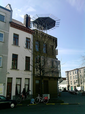
Antwerp with its stunning narrow town houses and tenements, with facades made of rich detailed brickwork and tall narrow windows, and joyful upper floor and roof details is a tall match for modern architecture and contemporary urban planning.

In both rich and dull streets, the narrow plots and buildings adds delight to the street elevation in a way that broad modern buildings with vertical and horizontal repetitive facade elements cannot match, and where maybe only the first floor facade will differ a little from the upper floors.

The failure of post-war architecture is particularly evident in Antwerp where post-war building heights have been increased around parks and along (traditionally) wide streets. Here the heights of the new buildings are almost ten floors, with repetitive horizontally orientated facades with few variations and few details. Whether one sees the buildings from close up or at a distance, they give nothing back to the public realm of the street.

A delightful roof light on a small corner building at Mechelseplein in the southern half of the city center.

Facades elements should differ on lower, middle and upper floors
However, Antwerp should learn from the past, and require new buildings to vary the facade elements on the various floors of a building. A rule of thumb would be to require the design of the two bottom and the two top floors of the facade to vary from the design of the middle floors. In addition the bottom and the top floors should be more richly detailed, to add joy and surprise to the street scene. Either as people hurry by on a daily basis or when they have more time and stop and study the building in more detail, discovering the richer details towards the top of the building as as one approached closer to the building. This latter principle  is applied to great effect on many modern early twentieth century buildings and adds joy and surprise to the public realm of the city. Any variations to set back roof floors come in addition to the principle of adding details to the top floors of the facade of a building.

A delightful something on top of a three storey house in the far north of the inner city.

Facades with depth and strong vertically elements should be encouraged
Antwerp should also learn from the past in requiring most buildings to have tall and narrow windows. Some early twentieth century buildings have very horizontally orientated facades, with long strips of windows with great success. But this principle has to a great extent been misused in a majority of post-war buildings, just adding dreariness to the public realm of the street. Buildings with windows along more than two thirds of the length of the facade in total should also in most cases be avoided. Similarly, most facades should normally have strong vertically orientated elements. And facades with little or no depth should in most cases be avoided, as the depth creates little shadows that will vary throughout the day. In a similar way trees add shadow that moves and changes with the moving sun.

And the above principles apply equally to Antwerp as to other towns and cities throughout the world.

Thursday, 28 March 2013

Post-war Vienna as a public realm misfortune

Vienna with its stunning central city, is somewhat the opposite in the rest of the inner city and the inner suburbs. Why the city appears so grey and dull is somewhat a mystery, but some mistakes are rather obvious.

The inner city housing built by the city after the World War 2 are mostly identical beige with large red lettering and add little joy to the local area. The post-WW2 housing is somewhat similar in color to the pre-WW2 housing, but the latter often has some detailing in the facade, adding a little joy to the buildings.

An illustrative scene showing how modern street installations can add dreariness to the public realm of a square.

Too quickly outdated modern street furniture
The streets and squares in the inner city are maybe a little too functional. It looks as if the city was at loss on how to design post-WW2 streets, and ended up with a strictly functional design stripped of trees, traditional street furniture and detailing in pavements and at junctions.

Squares often suffer the same fate as streets and junctions, where the joy of the public realm is restricted to brutal modern street furniture, more suited for a rural highway than an inner city setting. The many attempts of installing modern street furniture to squares and streets are somewhat a miss, as it too quickly looks outdated.

An scene demonstrating how old and new can be joined together with great success.

Look to Berlin and Paris
Vienna could look to Berlin and Paris to learn a thing or two about public realm. The two cities approach to street furniture and design is somewhat unique in that one 'timeless' standard design is used throughout the entire city, from the outer city limit to the inner heart. The 'timeless' nature of the design is interesting in that one cannot tell when a street has been upgraded, as the design is very robust and does not look damaged or aged. Maintenance standards are high and costs are considerably lower as the same elements are used throughout the city, year in year out. In Paris the same street-bench design has been used for over a hundred year, and it still looks as good as when new.

A modern square capturing all that is bad about public realm in post-WW2 Vienna.

Paris and to a lesser extent Berlin does depart from the standard design in selected high frequented or centrally located streets and squares, but with the clear understanding that this will cost more to maintain, and presumably with a long term will and mean to budget for this increase in maintenance.     

Thursday, 21 March 2013

Stuttgart in bleek winter monochrome

I recently had the opportunity to spend 24 hours in Stuttgart and although it is not the prettiest city, I was pleasantly surprised, maybe because my expectations were not so great. And this was mid winter, with only a trace of sun and a little drizzle.

Stuttgart has of course repeated the common mistakes of most post-war European cities, replacing trees with cars, forgetting the bike and bringing motorway architecture into the inner city. The lack of color and texture, when there is little tradition of exposed brick, adds to the bleakness of city, especially where glass and polished stone is allowed to reign.


However, the city is stunningly located in a valley, surrounded by hills in most directions and is fortunate to have many early twentieth century buildings with local stone details. And the center is full of an endless number of shops in a series of pedestrianized streets, concentrating the commercial heart within the center.

I was also fortunate to swim in a beautiful thirties pool and had then the opportunity to walk through the city by night, when the darkness hides the the worst excess of modern architects. The lack of color is less obvious when the city presents itself in monochrome, lit by orange street lights. And the awkward 1950s concert hall appears almost beautiful, with stunning details that looks almost 1970s.

And no, i did not see the Haus am Weinberg, the Mercedes Benz Museum, the Porche Museum, the  Stadtbibliothek or the Neue Messe, all stunningly twenty-first century buildings. But at the University in the middle of the city, it looks almost as if someone forgot to put up half the buildings.

So my advice to urban planners of Europe, is to:
i) Plant more trees, bigger trees, closer together
ii) Add more depth to facades by requiring windows and walls to have different depth
iii) Add more texture to facades by encouraging the use of bricks in part of the facade
iv) Encourage the use of color, avoiding 'soft colors only'

Sunday, 3 March 2013

The 7 Million Sustainable Dense City?

Australia has only 23 million inhabitants, but the population is increasing by 1000 people a day. This is maybe not so remarkable in a world where the population is increasing by 100.000 people a day. But for Australia this equals 1.6 % annually, and for the world (only) 0.6 % annually.

But housing 1000 new people a day requires a lot of new homes and rising house prices. New homes requires land, streets, water, power etc, and more people requires more parks, playing fields, shops, cars, transport, wifi etc. But sadly, the cities of Australia are growing as much outwards as they are growing inwards.

20-40 million new inhabitants require a different approach
Sydney and Melbourne as the two largest cities and Brisbane and Perth as the two most growing cities (in terms of proportion), are still partly stuck in a 1950s planning regime, where suburban lifestyle and the car is dominant, despite that household sizes are decreasing, people are growing older and there are fewer children around.

By mid twenty-first century the population of Australia may almost double to 43 million inhabitants and by the end of the century almost tripled to 62 million inhabitants. Then Australia may be the tenth most populous South-Eastern Asian nation. However, in doubling its population, the country may need to double the densities at which people live within its larger cities.

Me observing and reflecting upon the city center life outside the Central Post Office of Brisbane.
My time in Australia is coming to a close. I have thoroughly enjoyed my seven weeks in Sydney and two weeks in Brisbane. I also spent a weekend in the bushland north of Sydney. I have experienced how two large and rather suburban cities function, and observed with joy and horror their approach to a rapid growing population. I've met some very wonderful people, many who were recent immigrants from either Europe or Asia.

During my last three weeks in Sydney, I have spend a lot of time swimming in the sea, half the time next to my house in Double Bay, jogging around my neighbourhood of Bellevue, visiting the beaches at La Perouse twice, Middle Head twice, Watson Bay once, Nielsen Park once, Otford once, travelling on the ferry to Circular Quay and to Watson Bay, swimming at the pool at Woolloomooloo and kayaking half way to Shark Island.

Leaving Australia for Europe makes me somewhat sad and exiting. Sad because I leave Sydney in late summer but before the autumn starts for real. Exiting because I arrive in Europe in early spring, but maybe a little too early as there is still snow in much of northern half of the continent.

2-3 million new inhabitants in one city alone
In Sydney and Melbourne, that may sound like an utopian dream or nightmare, but it may not be so difficult. Thinking back 50 years, there were few high risers, and thinking forward, many parts of the two cities would benefit from more medium high rise living. By doubling the proportion of the two cities with double the average density, the two cities could accommodate half as many people as today, increasing from 4-4.5 million to 7 million inhabitants. And a similar pattern could be applied to Brisbane, Perth and other cities throughout Australia (and elsewhere), with the ratios a little different.

Doubling the proportion of the city with double density may not seem so difficult. But increasing the density in already high density districts may seem a much more daunting task. But by targeting the lower density developments within a designated district and replacing it with double the highest density in the same distinct, densities could substantially increase in the designated district as a whole. In other words, the most important may be do identify the lower density developments close to higher density developments that could be subject to (much) higher densities. The reason for this, is that these areas are the ones that could offer the largest gain. This approach would be in contrast to an approach that would aim to achieve higher densities throughout (the entire) designated district.

Sydney's Hyde Park where residential buildings heights are restricted along west (right) and east sides but less so along south side (left).
Preserving identity and heritage
In terms of identity and heritage, this choice of approach could be more successful, as some of the higher density developments may have qualities that would be valuable to preserve. This could be a high street, historically with higher density. So rather than increasing densities in the high street itself, densities could be increased (substantially) in the side streets, where (historically) densities are lower, preserving the older higher density high street. This should of course not be seen as a blanket ban on increasing densities elsewhere within a designated district, but in areas that already have higher densities, the approach could be more cautious.

Of course this approach would result in the loss of a large part of low density developments adjacent to and within higher density areas, but this may be a long term gain for a wider community, as the concentration of services and functions within the (new and larger) higher density district would increase as a result of many more people living within such a higher density district. This approach does not mean that all the lower density development must be replaced with densities double the highest density development. But it will mean that all the (designated) lower density development must be replaced.

Tuesday, 12 February 2013

Gold Coast as post-modern hell or heaven?

The Gold Coast has half a million inhabitants spread over a 400 sq km large area, along a 30 km long sand beach. The waves along the beach make the area an ideal spot for surfers and life guards, tourists, students and weekend visitors. But why half a million inhabitants chose to live in this post modern suburbia demands a more complex analysis.

Surfers Paradise with three of the worlds tallest residential towers looking north towards Main Beach and Southport. Most buildings are 'only' 20-35 stories.
The area is reach by motorway or the adjacent direct rail service from Brisbane and the Airport. It easy to see why the planners chose to locate the rail line along the motorway, but apart from a good location for Park & Ride, the rail service is something of a oddity. The train is soon to be supplemented with a tram line along the coast, the two eventually intersecting at the northern and southern end.

As in the central business district of Brisbane, there are not height restrictions on buildings along parts of the Gold Coast, with the result that three of the worlds tallest residential tower of 70-80 stories are located here, together with two dozen towers of 40-50 stories, half of which area located in central area of Surfers Paradise, and the other half either in neighboring Main Beach, Southport, Broadbeach or further south towards the border with New South Wales.

High-rise living in Brisbane adding to the housing supply of Queensland?
 
Infinity, a not yet completed residential tower, with 550 apartments on 80 stories, seen from Wickham Park looking south.

 A residential tower seen from the City Botanic Gardens looking northwest.

Another residential tower seen from Brisbane Square looking west.

Tuesday, 5 February 2013

Brisbane as a Mini-Manhatten of the Southern Hemisphere

The center of Brisbane is buzzing with life in the afternoon and early evening with people out shopping, eating, drinking or on their way home from work. It's a center dominated by offices and shops, but also with some dense or high rise (luxury) housing. There are no height restrictions in the business center, so two residential and one multi-function building are 70-80 stories high, and another 50 buildings have 25 stories or more.

Recent War Memorial with 8 stories 1920s building left and two modern high risers in middle (apartments) and right.
The shops are organized mainly on two levels, ground floor and lower ground floor, often interconnected under the street and throughout the entire block. In Queen Street, the pedestrian street is filled with bars and cafes in the middle, as permanent glass and steal structures.

Semi-shaded pedestrian path in the park at South Bank, adding to the attraction of inner city living.
Brisbane is however maybe lacking semi-dense inner city accommodation in close proximity to the city center. The reason for this is partly historical, with bungalows surround the city center. But planning for more semi-dense inner city accommodation would maybe add to both the attraction of Brisbane as a world city, and Brisbane's city center. The alternative for most small households is to live in the suburbs, with the inconvenience of traveling long distances for work and other activities. Suburbs are maybe more suitable for families and older residents, that do not commute to work every day.

Brisbane City Hall seen towards south east with square and (small) church tower to the north west.
I have mostly spent my time visiting the parks and outdoor artificial beach at the South Bank, walked and cycled around the center, the inner city and along the river, and spent one day at the Gold Coast. I live almost 10 km south east of the center, in a modern house with a pool, in a well off suburb, close to the intersection between motorway M1 and M3.

Dedicated bus ways and cycling facilities
In Brisbane there are underground bus stations, which are connected to dedicated bus ways in three directions from the center, one 25 km long running parallel to the motorway reaching the south eastern suburbs of the city, with 'stations' every 2-3 km, and separate junctions from the motorway. The stations have 100 meter long platforms with roof, stairs and lifts and a fence stopping people from crossing the driveway.

Church across square from City Hall with three highrise buildings surrounding it to the northwest.
There is also walking and cycling paths along the river and some running out of the city. Outwith the city center, cycling on the pavement is not too uncommon. And yes, you have to wear a cycling helmet in Queensland, also when using one of the 1000 city bikes, like the ones in Paris, spread out on 100 stands throughout the inner city. But the pricing is regressive, so using them more than 30-60 min costs you dearly.

But it is the car the rules in Brisbane, as elsewhere in Australia, with a motorway along the northern banks of the river through the city center. Brisbane is after all a very modern city, mostly built during the second half of the twentieth century.

Free 'swimming' pool with artificial sand beach in park at South Bank across from city center with river in background looking north east.

Thursday, 24 January 2013

Cowboy Town Architecture Sydney Style

Built heritage has a very important meaning in Sydney, but it is mostly 20 century heritage that is preserved, as older buildings are few and far between. In the suburbs it is mostly early bungalow architecture that is preserved, in specially selected areas, usually the wealthier ones. In the city center there is a wider selection of heritage that is preserved, included early townhouse and a variety of commercial and public buildings.

But a lot of the preservation is restricted to facades facing the street only. This applies both to the bungalows, where the front elevation including the roof up to the pitch is preserved, and townhouse facades, but not the roof, and not the space above. 

Four or five floors added to original two story commercial building.
The heatwave here is over and it is back to 25-30 degree C. At the warmest it was 46 degree C at mid afternoon on Friday 18.02, when I was partly on the train into the city (without air condition), a little walk in the center, and partly on an air conditioned bus to the beach.

During my first three weeks in Sydney I had time to run five times, yoga eight times, swam seven times, five times in the ocean at Manly, Mosmann and La Perouse, and three times in the pools at Woolloomooloo, Victoria Park and Milsons Point. I also walked five times along the beach, trice north of the city between Palm Beach and Manly, once around North Head at Manly, once near Botany Bay south of the city, as well as once in the Blue Mountains at Blackheath west of the city. In addition I was once on the river ferry from Parramatta to Circular Quay as well as on the ferry across the bay to Manly half a dozen times. I also experienced Australia Day with free concerts in the city center at Circular Quay and in the Domain park.

Original facade preserved with new interior, two extra floors and adjacent high rise building 

Cowboy town architecture
So looking more carefully at some bungalows, traces of the modern side facades reveal that the house is entirely rebuilt, or looking carefully through the windows or front door, the houses may be totally transparent at the rear, often with open plan ground floors and few internal walls.
In the city center, things are a little different, as a facade can be preserved, but any number of floors added on top. Some of the tallest buildings of 20-30 floors in the city have preserved 3-5 floors facades at the bottom, either as a free standing structure or integrated in the new building. Alternatively, the old structure stands adjacent to a new building, up to 10 times taller than the adjacent older building.

This type of preserving the built heritage works quite well in many areas of Sydney. However, there are some rather disastrous areas, especially where 1960s, 1970s and sometimes more recent architecture or town plans dominates.

Two apartment buildings erected behind preserved bungalow at Manly beach front